
Have you ever wondered why some color combinations look beautiful while others feel uncomfortable to the eyes? Why do certain brands use blue, while others prefer red or green? Why does one website look clean and professional, while another feels confusing even though both contain the same information?
The answer often comes down to color theory.
Color theory is one of the most important design principles used in web design, graphic design, branding, photography, illustration, marketing, and user interface (UI) design. It helps you understand how colors relate to one another and how different color combinations influence the way people see and interact with a design.
The good news is that you don’t need to be a professional designer to learn it. Once you understand a few basic concepts, choosing colors becomes much easier, whether you’re designing a website, creating social media graphics, building a mobile app, or simply selecting colors for a personal project.
In this beginner-friendly guide, you’ll learn the fundamentals of color theory in simple English, understand the color wheel, explore different color relationships, and discover how to choose colors that work well together.
What Is Color Theory?
Color theory is a set of practical guidelines that explains how colors work together and how they affect visual design. It helps designers choose colors that create balance, contrast, harmony, and a better user experience.
Instead of selecting colors randomly, color theory provides a structured approach for building attractive and meaningful color combinations.
Think of it as a map that helps you understand which colors naturally complement each other and which combinations should be avoided.
Today, color theory is used in many creative fields, including:
- Website design
- Graphic design
- UI and UX design
- Logo design
- Branding
- Interior design
- Photography
- Digital illustrations
- Advertising
- Product packaging
Whether you’re creating a landing page or designing a company logo, understanding color theory makes your work look more professional and visually consistent.
Why Is Color Theory Important?
Many beginners focus only on choosing colors they personally like. However, successful design is less about personal preference and more about creating a visual experience that is easy to understand.
Good color choices can help users quickly identify important information, improve readability, and create a stronger emotional connection with a product or brand.
For example:
- A healthcare website often uses blue because it creates a feeling of trust and reliability.
- Food delivery apps commonly use red or orange because these colors naturally attract attention.
- Eco-friendly brands frequently use green to represent nature and sustainability.
These choices are not random they are based on color theory and years of design experience.
When you understand how colors work together, you can:
- Improve website readability
- Build stronger visual hierarchy
- Make buttons stand out
- Increase user engagement
- Create a consistent brand identity
- Design attractive user interfaces
- Reduce visual clutter
This is why color theory is considered one of the foundations of modern design.
Understanding the Color Wheel
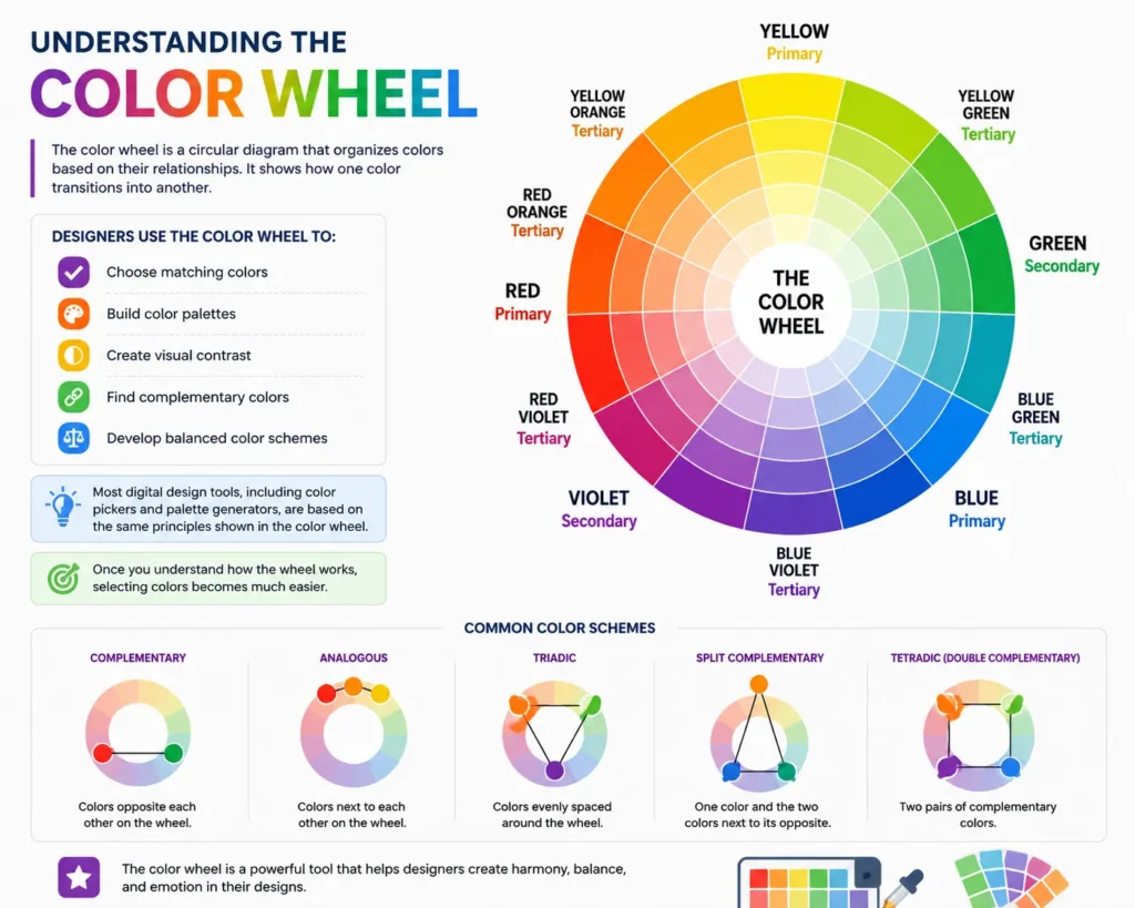
The color wheel is one of the first concepts every beginner should learn. It is a circular diagram that organizes colors based on their relationships.
Rather than viewing colors as separate shades, the color wheel shows how one color transitions into another.
Designers use the color wheel to:
- Choose matching colors
- Build color palettes
- Create visual contrast
- Find complementary colors
- Develop balanced color schemes
Most digital design tools, including color pickers and palette generators, are based on the same principles shown in the color wheel.
Once you understand how the wheel works, selecting colors becomes much easier.
1. Primary Colors
Primary colors are the starting point of every color system because they cannot be created by mixing other colors together.
The three primary colors are:
- Red
- Blue
- Yellow
Every other color on the traditional color wheel is created by combining these primary colors in different proportions.
For beginners, it’s useful to think of primary colors as the building blocks of color theory.
2. Secondary Colors
Secondary colors are created by mixing two primary colors.
| Primary Colors | Secondary Color |
|---|---|
| 🔴 Red + 🟡 Yellow | 🟠 Orange |
| 🟡 Yellow + 🔵 Blue | 🟢 Green |
| 🔵 Blue + 🔴 Red | 🟣 Purple |
These colors introduce more variety into your designs while still maintaining visual balance.
Understanding secondary colors helps you build better color combinations without relying on guesswork.
3. Tertiary Colors
Tertiary colors are created by mixing a primary color with a nearby secondary color.
Examples include:
| Tertiary Color |
|---|
| 🔴 Red-Orange 🟠 |
| 🟡 Yellow-Orange 🟠 |
| 🟡 Yellow-Green 🟢 |
| 🔵 Blue-Green 🟢 |
| 🔵 Blue-Purple 🟣 |
| 🔴 Red-Purple 🟣 |
These colors add subtle variation and are commonly used in illustrations, branding, website backgrounds, and modern UI design.
Because tertiary colors sit between primary and secondary colors, they often create smoother visual transitions.
Warm and Cool Colors
One of the easiest ways to understand color theory is to divide colors into two groups: warm colors and cool colors.
Warm Colors
Warm colors include:
- Red
- Orange
- Yellow
These colors feel energetic, exciting, and attention-grabbing. They are often used for call-to-action buttons, promotional banners, sales campaigns, and warning messages.
Cool Colors
Cool colors include:
- Blue
- Green
- Purple
These colors create a calm, relaxing, and professional feeling. Many technology companies, healthcare brands, educational websites, and finance businesses use cool colors because they inspire trust and stability.
Choosing between warm and cool colors depends on the message you want your design to communicate.
Choosing the Right Color Combination
Selecting colors isn’t just about making something attractive. The right color combination improves readability, guides attention, and creates a better user experience.
Here are a few practical tips:
- Limit your palette to three to five primary colors.
- Use high contrast for important text and buttons.
- Keep background colors simple.
- Avoid using many bright colors together.
- Test your design on both desktop and mobile devices.
A balanced color palette often looks more professional than one that contains too many competing colors.
Color Theory in Web Design
Color theory plays a major role in modern web design.
The colors you choose influence how visitors interact with your website. They can highlight important actions, improve navigation, and create a memorable first impression.
For example:
- Blue is commonly used for technology and finance websites.
- Green is popular for health, education, and environmental brands.
- Red is often used for sales, alerts, and limited-time offers.
- Orange works well for call-to-action buttons.
- Purple is frequently associated with creativity and luxury.
A well-planned color palette makes a website easier to use while strengthening its visual identity.
Color Theory in Graphic Design
Graphic designers rely on color theory to create balanced layouts, posters, logos, advertisements, product packaging, and social media graphics.
Instead of selecting colors randomly, they build color palettes based on harmony, contrast, and the message they want to communicate.
This approach helps create designs that are both attractive and easy to understand.
Conclusion
Learning color theory for beginners isn’t about memorizing every color combination. It’s about understanding how colors relate to each other and using that knowledge to make better design decisions.
By learning the color wheel, primary and secondary colors, warm and cool colors, color harmony, and popular color schemes like complementary, analogous, monochromatic, and triadic, you’ll be able to create more balanced and visually appealing designs.
Whether you’re building a website, designing graphics, creating a logo, or choosing a color palette for a personal project, these fundamentals will help you work with greater confidence. As you gain experience, experimenting with different color combinations will become easier, allowing you to create designs that not only look attractive but also communicate the right message to your audience.